Background
As part of my thesis, I documented the process used so that others could replicate my results. This section provides step-by-step instructions for generating a topic model using Orange and Excel. Information regarding initial data collection and associated challenges from the Web of Science database is described in Annex B. The list of stop words used is provided in Annex C.
Software Required:
- Orange V3.8 and above (https://orange.biolab.si/download/)
- Microsoft Excel (https://products.office.com/en-ca/excel)
Data Acquisition
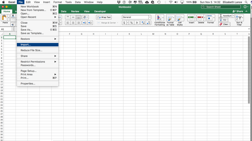
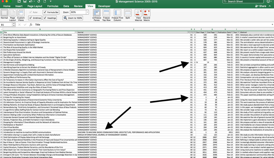
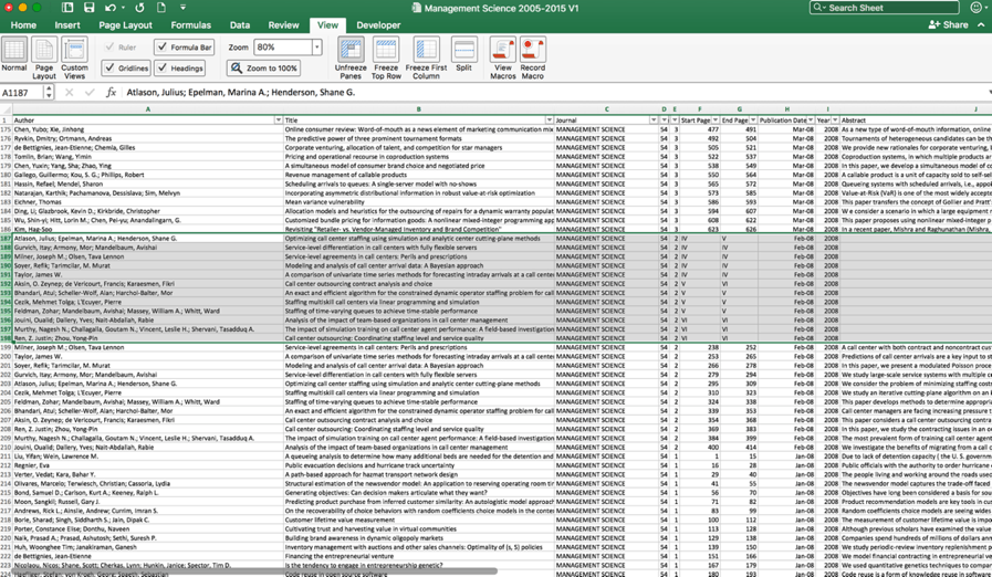
Retrieve information from selected journal database, including: authors’ name, article publication year, title, abstract. Import into MS Excel and merge, removing excess columns and adding clear headers.
Data Preprocessing
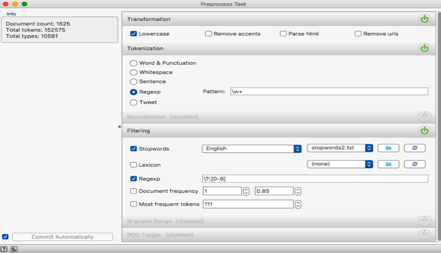
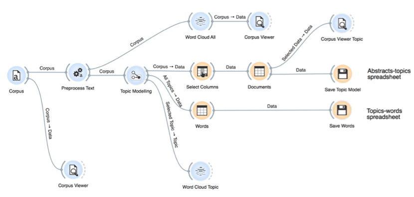
Replicate workflow and preprocessing as per Figure 7-1 and Figure 7-2. (For stop words, see Annex C.) Standardize any terms that may be affected by the normalization process (ex. change “R&D” to “RandD”).
Generation of Topic Models
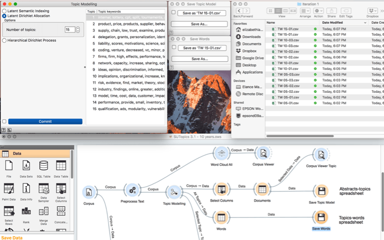
- Generate models for topic models at various increments (5, 10, 15 …) by identifying the desired number of topics under the “Topic Modelling” module.
- For each model:
- Generate and save word clouds for each topic in each model.[1]
- Save outputs (Models, Words) as CSV files.
- Save top 10 keywords for each topic model as a report.
- Combine all Model CSV and Word CSV files into a single Excel file.[2]
Selection of Optimal Topic Model
Since the purpose is to find the model with useful information, the selection of the optimal model is inherently subjective as it is based on the researcher’s initial research questions and their ability to interpret the model. These heuristics may be used in conjunction with others.
Overall Importance of Topics
Calculate the overall importance of topics. On each sheet:
- Determine the average weight of each topic (use =AVERAGE function in Excel at bottom of each column).
- Sort topics left-to-right for highest-to-lowest average weight.
- On a new sheet (“Summary”), import the top 10 keywords for each model. Create a column to identify the topic model (5, 10, 15 … etc.), topic number (assigned by Orange), topic weight (copied from individual sheets, transposed as required).
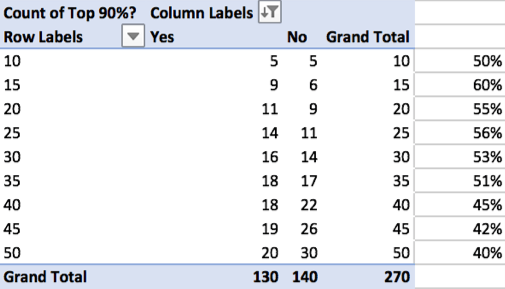
- In a new column, identify the topics that represent 90% of papers for each model (use highlight feature in Excel).
- Create a pivot table (Data -> Summarize with Pivot Table) that identifies the number of topics per model that represented the top 90% of topics. Save on a new sheet (“90%”).
- Generate charts to visualize the summarized results from the pivot tables (Insert -> Chart).
Coherence
(Note: In the previous step, all the topics that represent less than 10% of the total topics within a given topic model should be removed from future analysis using the filter functionality in Excel.)
Coherence is determined by conducting the following steps:
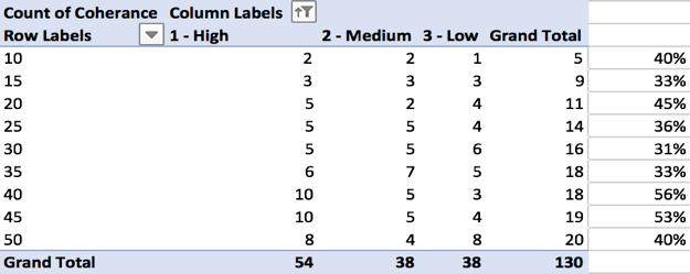
- On the “Summary” sheet, review the keywords for the topics that are included in the top 90% of each topic model for coherence.
- In a new column, manually assign a score of high, medium, or low cohesion in a separate column.
- Create a pivot table that identified the number of topics per model and counted the coherence labels of high, medium, or low cohesion. Save on a new sheet (“Coherence”).
- Generate charts to visualize the summarized results from the pivot table.
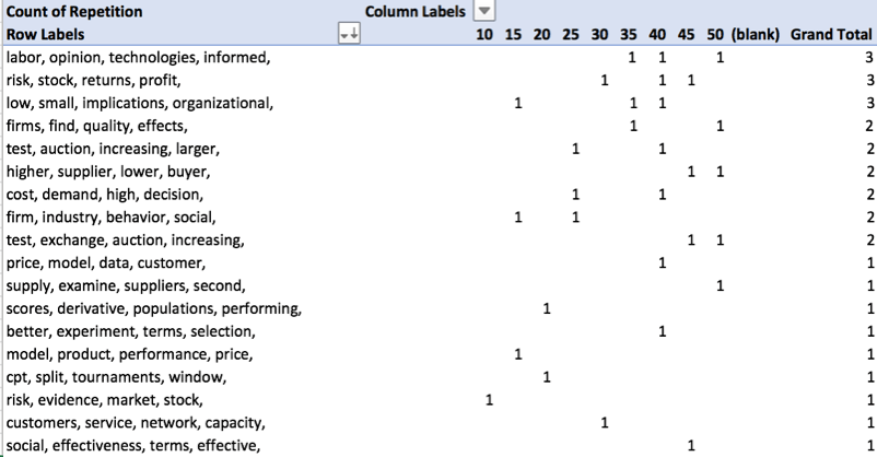
Duplicate / Recurring Topics
- In a new column, create a formula in Excel to show only the first 2-4 words for each topic label and added a column where the number of words to include is identified:
- =TRIM(LEFT(SUBSTITUTE(E2,” “,REPT(” “,1000),R2),1000)), where E2 is the cell containing text to be trimmed and R2 is the cell that identifies how many words to include.
- Generate pivot tables and charts to identify # of identical topics for 3, 4, and 5 words.
- Generate pivot table and chart to identify model containing most duplicate topics.
Select topic model based on review of current and previous heuristics. Proceed to labelling of topics in topic model.
Labelling Topics (Initial Interpretation)
This section assumes that a topic model has been selected. It discusses initial interpretation of the results.
Topic Headwords
- Organize the topics in terms of topic weight from highest to lowest (top to bottom). Insert column and number [1…n].
- Use the TRIM formula in Excel to show only the first 2-4 words for each topic labelled as “High” or “Medium”
- Review automatically generated labels. Adjust for ease of reading (as required).
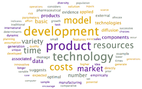
Word Clouds
- Review word clouds associated with each topic to determine if the topic labels can be further refined, based on context. (Larger terms have higher weights within the topic.)
- Adjust topic labels as required.
Review of Abstracts and Titles
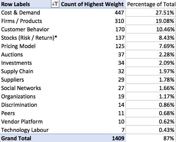
- In the sheet for the selected topic model, insert two new columns: Highest Weight and Second Highest Weight.
- Use the INDEX function of Excel to identify the topic with the highest weight across all topics in the topic model. =INDEX($A$1:$AN$1,0,MATCH(LARGE($A2:$AN2,1),$A2:$AN2,0))
- Use the INDEX function of excel to identify the topic with the second-highest weight across all topics in the topic model.
=INDEX($A$1:$AN$1,0,MATCH(LARGE($A2:$AN2,2),$A2:$AN2,0))
- Generate a pivot table that identifies the number of articles associated with the highest topic for each article.
- In the original spreadsheet, use the Sort & Filter functionality to identify highest-weighted articles in each topic.
- Review titles & abstracts for articles for top ~10% of highest weighted articles for each topic (more if the count is less than 10 articles). If required, adjusted “Highest Weight” manually so article is associated with in a new column.
- Adjust topic labels as required.
Final Topic Model: Description and Visualization
After selection and verification of the model, generate a final list of topics and their interpretation based on the word clouds, article titles / abstracts reviews.
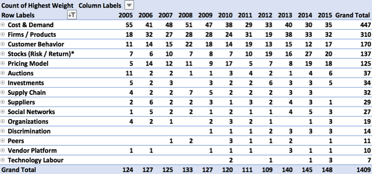
Visualization: Distribution of Articles Across Topics By Year
- If it does not already appear in the topic model spreadsheet, add information regarding publication year for each article.
- Create a pivot table identifying the publications per topic, per year.
- Highlight and create a chart based on the pivot table. Adjust as required.
Visualization: Evolution of Topics Over Time
- If not in the topic model spreadsheet, add information regarding publication year.
- Create a pivot table identifying the average weight of each topic, per year.
- Create a chart based on the pivot table. Adjust as required.

[1] Important: While generating word clouds is time consuming activity, there is currently no way generate them after the topic model has been generated (i.e., they must be saved at the same time as all other exports are saved).
[2] To expedite the process, a software program called “Professor Excel” can be used. This allows the importing of multiple sheets to a single workbook concurrently (as opposed to a manual, sequential process); however, this is a paid product. Alternatively, this can be completed using a VBA macro.